Frere-Jones Wins National Design Award
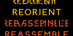
After three decades of designing many of the world’s most iconic typefaces—from Interstate to Gotham to Whitney—Tobias Frere-Jones 92 GD has earned the 2019 National Design Award (NDA) for Communication Design. It was among the awards presented at Cooper Hewitt’s annual gala in NYC, which was held at the national design museum on October 17.
“This carries a special honor for me as it is only the second time a National Design Award has been conferred for typeface design,” Frere-Jones notes, underscoring the esoteric nature of an art form enshrouded in the world of graphic design.
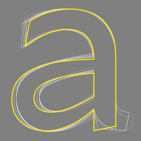
While we all see and use fonts every day, they’re also so pervasive that they often go unnoticed—sort of like the bricks of a building that are easily overlooked and undervalued.
As increasingly more people have begun to understand the importance of design in everyday life, type design is also more valued than in the past—but it still lacks the recognition designers know it deserves.
“Before anything else, good design starts with clear intentions.”
Frere-Jones actually got started designing letterforms in high school, finding it to be an “unlikely intersection” of the love of writing he got from his family and his nascent passion for abstract painting.
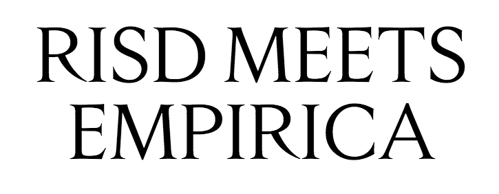
At that point he “didn’t understand just how obscure this field was and that instruction would be so hard to find,” the NYC-based designer said in a recent Cooper Hewitt interview. “But through professors at RISD, I was able to make my first contacts in this field.”
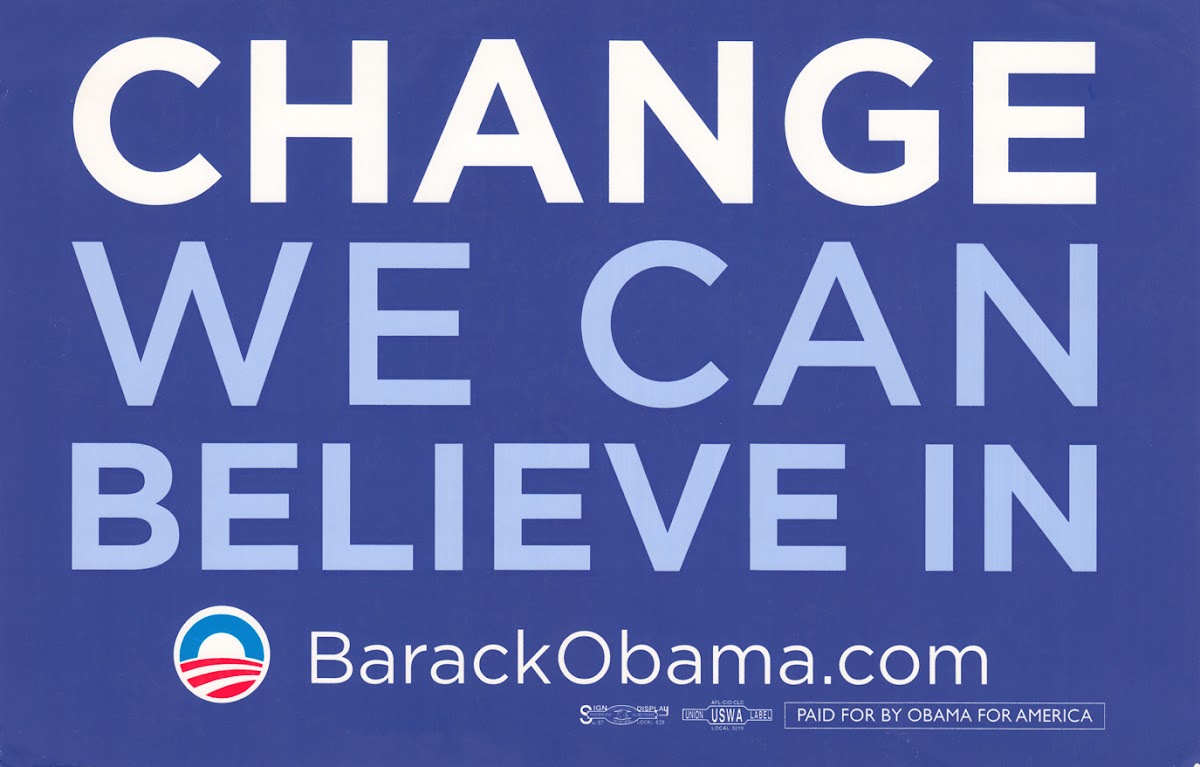
In the 30 years of professional practice since, Frere-Jones has worked to combine “technical expertise with historical perspective” in designing original typefaces for licensing and clients ranging from the ACLU to Nike, The New York Times and the Whitney Museum, among others.
Recognizing that “type exists to solve problems,” he also believes that “beauty” should always be part of the solution.
In designing Gotham (2000–2009), for instance, Frere-Jones scoured the streets of New York block by block, examining the lettering that appears in public spaces—largely made by engineers as opposed to designers.
“Racing against the wrecking ball, I made a photographic archive of a craft that was quickly vanishing with gentrification,” he explains. “These images became the central reference in preserving the flavor and expanding the range of these ‘outsider’ forms.”
While Interstate (1993–1999) “began as a personal challenge to build a typeface from the unlikely source of highway signs,” Retina (2000–2016) grew from a Wall Street Journal commission to design better tiny type for stock listings.
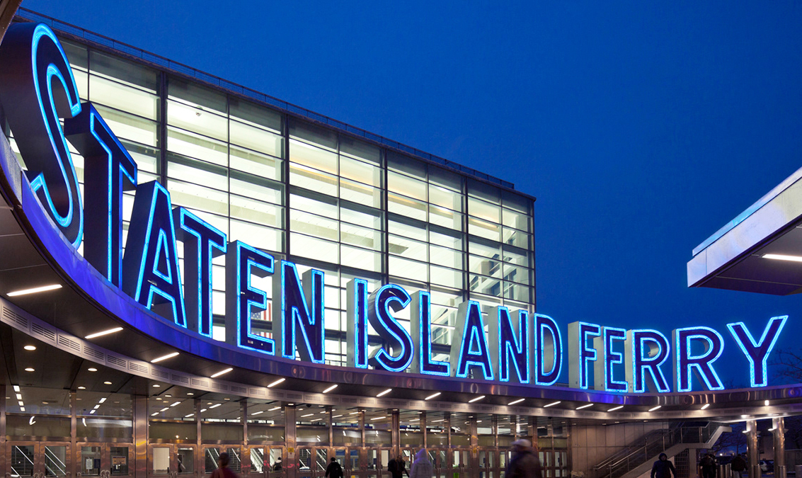
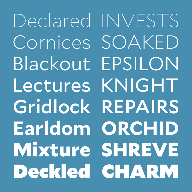
Inspired by the marriage of his English mother and American father, Mallory (2014–15)—which is also Frere-Jones’ own middle name—began as an experiment in blending British and American typographic traditions.
“The first is tidy but potentially cold,” Frere-Jones told Dezeen. “The other is friendly but sometimes too casual. So the idea was to isolate the best aspects of these genres and combine them. The end result is a 'permissive' geometric, one that is both orderly and approachable.”
Regardless of what he’s designing, Frere-Jones believes that good design needs to be “decisive, self-aware and informed”—a belief he also brings to his teaching at Yale School of Art.
“Before anything else, good design starts with clear intentions,” he says. It needs to reflect “a sense of humor, or a sense of responsibility—a kind of humility.” And it needs to “know what it’s made of and who it’s made for.”
“I’ll be showing what type design... provides to our wider culture.”
Now that Frere-Jones has won the National Design Award—adding to previous recognition in the form of the Gerrit Noordzij Prijs and the AIGA Medal—he is especially interested in the educational aspects of the NDA, which included events during National Design Week and subsequent touring events that give him opportunities to explain his craft to a wider audience.
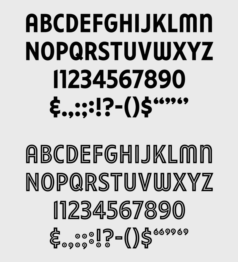
“I’ll be showing what type design—mine or anyone else’s—provides to our wider culture,” Frere-Jones says. “And that is the part that is most humbling and exciting.”
—Liisa Silander
October 31, 2019