
Students in a fall studio are exploring a wide range of motion design techniques, from stop-motion animation to film title sequencing.

“The poster as we think of it more or less emerged in tandem with large-scale printing technology in the 1880s,” says Graphic Design Professor Nancy Skolos. “When lithographic printing came of age, it captured the imagination of artists, bringing their visions into the streets of Paris.”
One hundred and twenty-five years later, the poster continues to be a go-to medium for artfully disseminating information. And at RISD, Skolos’ Reframing the Poster elective has become a rite of passage for Graphic Design students.
Skolos and her partner, RISD faculty member Tom Wedell, are known for their work in this realm and have earned numerous awards for pieces shown in the Warsaw, Lahti, and Toyama Poster Biennials and Triennials. Skolos + Wedell posters are included in the collections of the Museum of Modern Art, the Cooper Hewitt Smithsonian Design Museum, the Library of Congress, and many others.
The course Skolos developed invites students to explore the poster in analogue and digital forms both still and in motion. As the semester proceeds, creative prompts progress from individual posters to sequences to site-specific installations that investigate the potential for interactive discourse in public space.
This fall’s class began by studying a wide variety of historical posters, from American circus posters dating all the way back to the late 1700s to the four-color artistry of Henri de Toulouse-Lautrec to contemporary works by graphic designers like Bráulio Amado. They then applied the techniques they learned, including outline strokes, woodcut printing, and lithography, to personal projects of their choosing, considering such aspects as scale, frame, and surface.
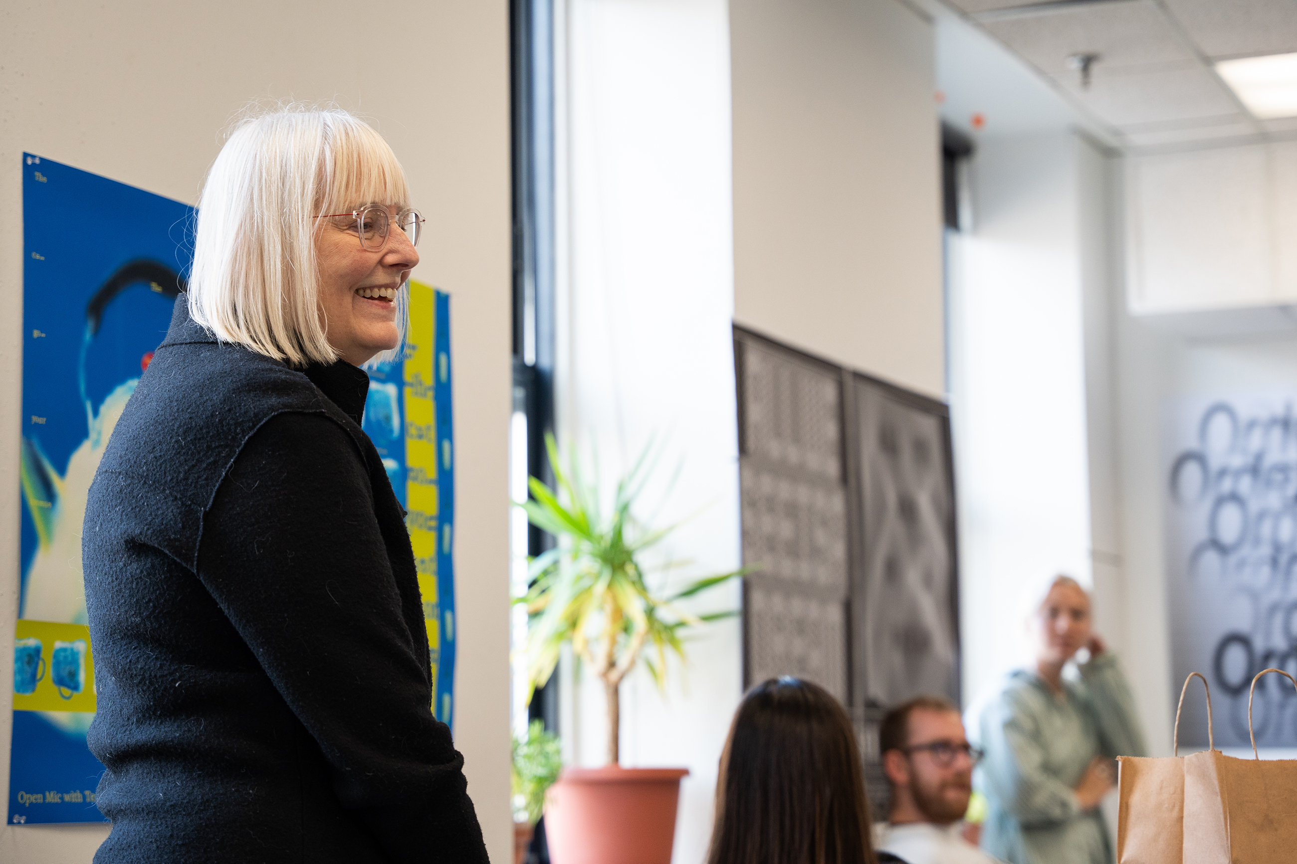
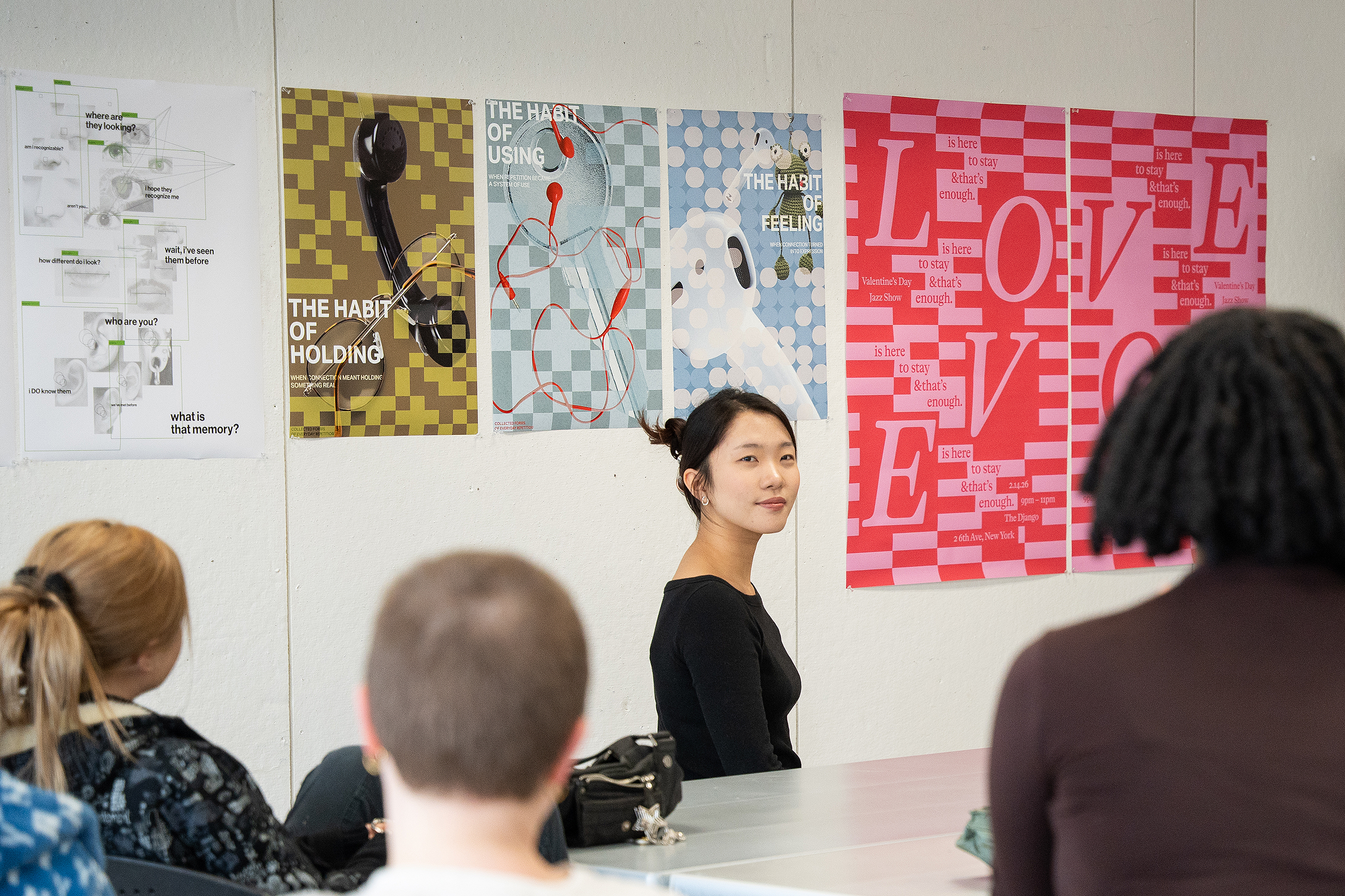
In mid-November the class gathered to discuss poster series each student created reflecting their growing skill sets. They were tasked with generating a series of (at least two) posters that combine type and image to convey a message.
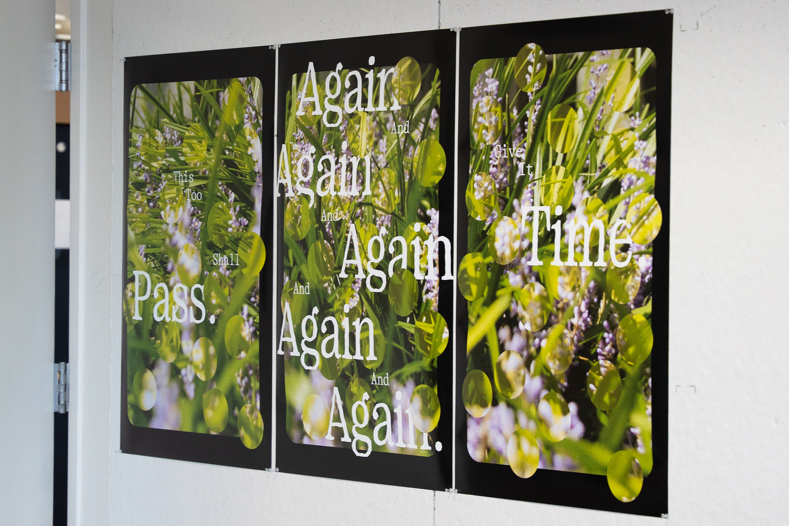
Senior Henie Cho 26 GD began with one word—love—and used color and the arrangement of repeated letterforms to express its complicated meaning. “I appreciate how big the type is because love is a big thing,” Skolos noted. “And the hierarchy you’ve created using smaller type, the negative spaces, and the colors all work together. It’s visually delightful!”
Grad student Buck Buettner MFA 28 GD chose a straightforward topic for their series—the contents of their lunchbox—and used expressive hand-drawn lettering to complement the colorful images included. “I have been feeling like my designs are too sterile and lacking in human touch, so I drew the letterforms with paint markers and then scanned them in,” they explained.
Senior Jun Jang 26 GD presented a poster series he created for San Francisco’s art-meets-science museum, the Exploratorium, that featured nearly hidden messages within the designs. Skolos liked the variety of patterns and typefaces he included and wondered how the posters would look as full bleeds with psychedelic colors such as magenta and green instead of the black and white he chose.
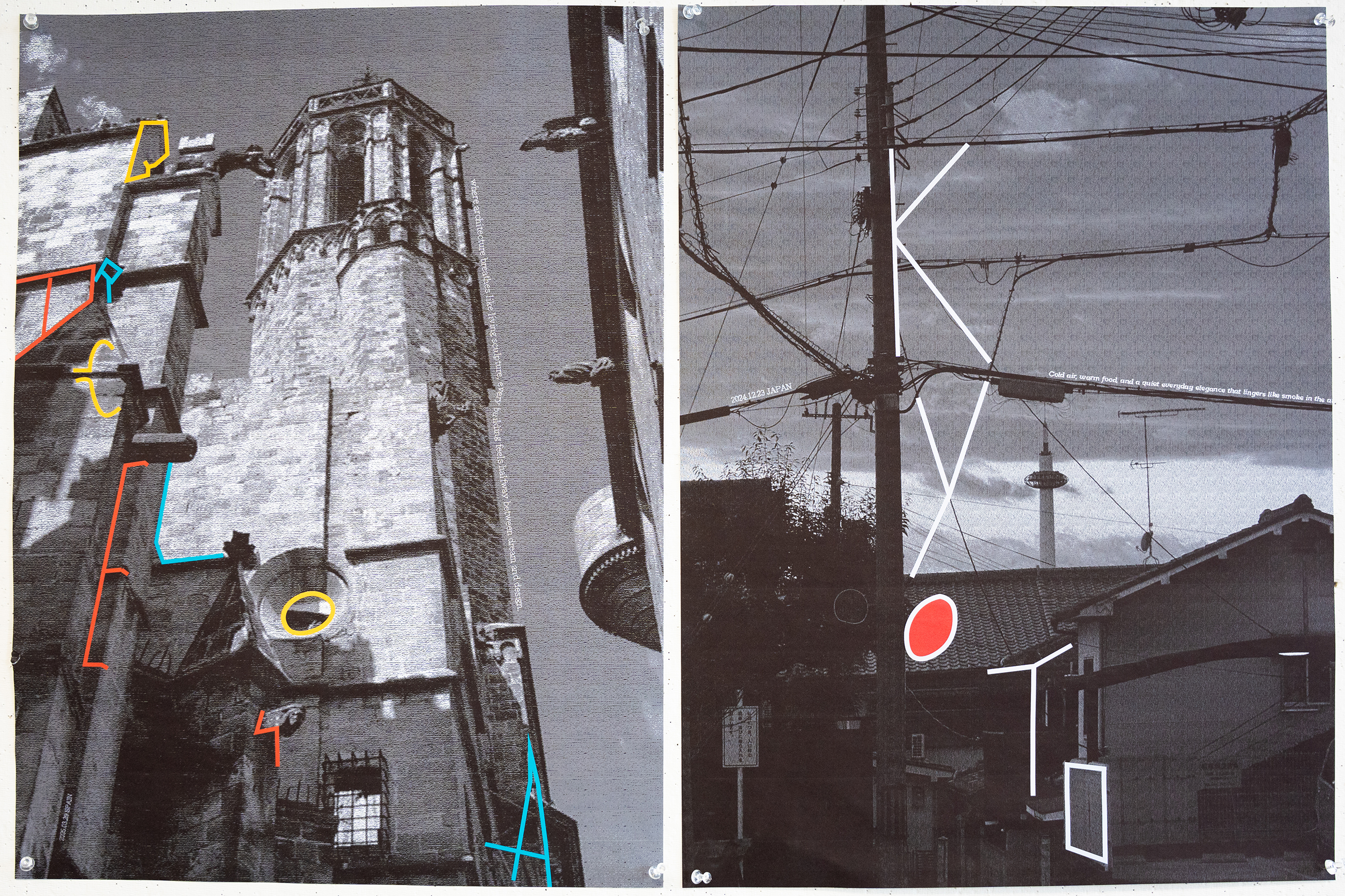
Another mostly black-and-white series that made a strong impression was created by Zenie Lu 26 GD, who artfully placed four-color letterforms over her own black-and-white photos of Barcelona and Kyoto. “I intentionally selected these photos to make the series more personal,” she explained. Skolos described the work as “expressive, sophisticated, and unique,” and the rest of the class encouraged Lu to make more posters featuring other cities around the world.
As the fall semester comes to an end, students will continue to explore new contexts and interactions for posters and will brainstorm ideas for using the work to activate the mezzanine space in the Fleet Library. All of the class’s posters will be on view in the Design Center’s GD Commons in early January.
Top image: senior Seoyeon Kweon presents a three-poster series inspired by the contents of her handbag.
Simone Solondz / photos by Kaylee Pugliese
November 25, 2025
Students in a fall studio are exploring a wide range of motion design techniques, from stop-motion animation to film title sequencing.

The end-of-semester rite of passage teaches students to discuss their work, give and receive constructive criticism and push the boundaries of their burgeoning practices.

An Experimental and Foundation Studies assignment focused on cowboy culture inspires a wide range of responses and meaningful dialogue.